More recent old maps (and the shapes in the details)
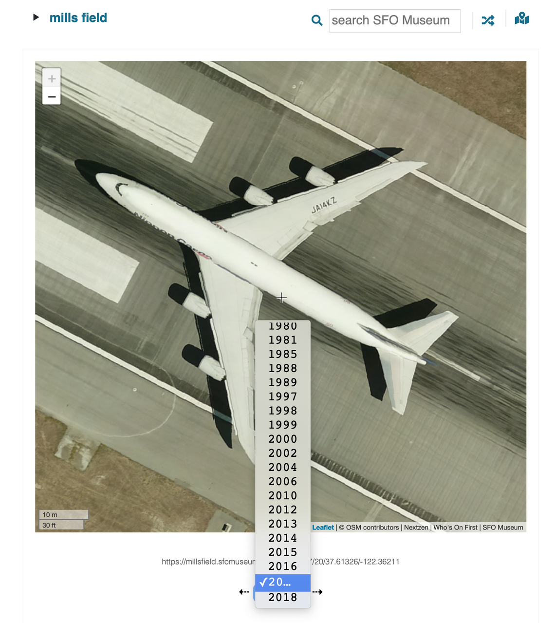
We recently updated the Mills Field website to include new historic aerial maps from 2010 through 2018.
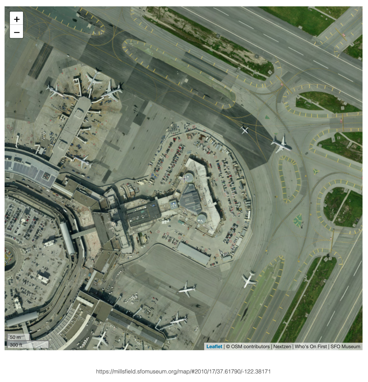
For example, here is Terminal 2 (T2) being renovated in 2010. It’s sometimes hard to grasp just how big modern airplanes are but you can start to see their scale next to a parking lot full of regular-sized cars.
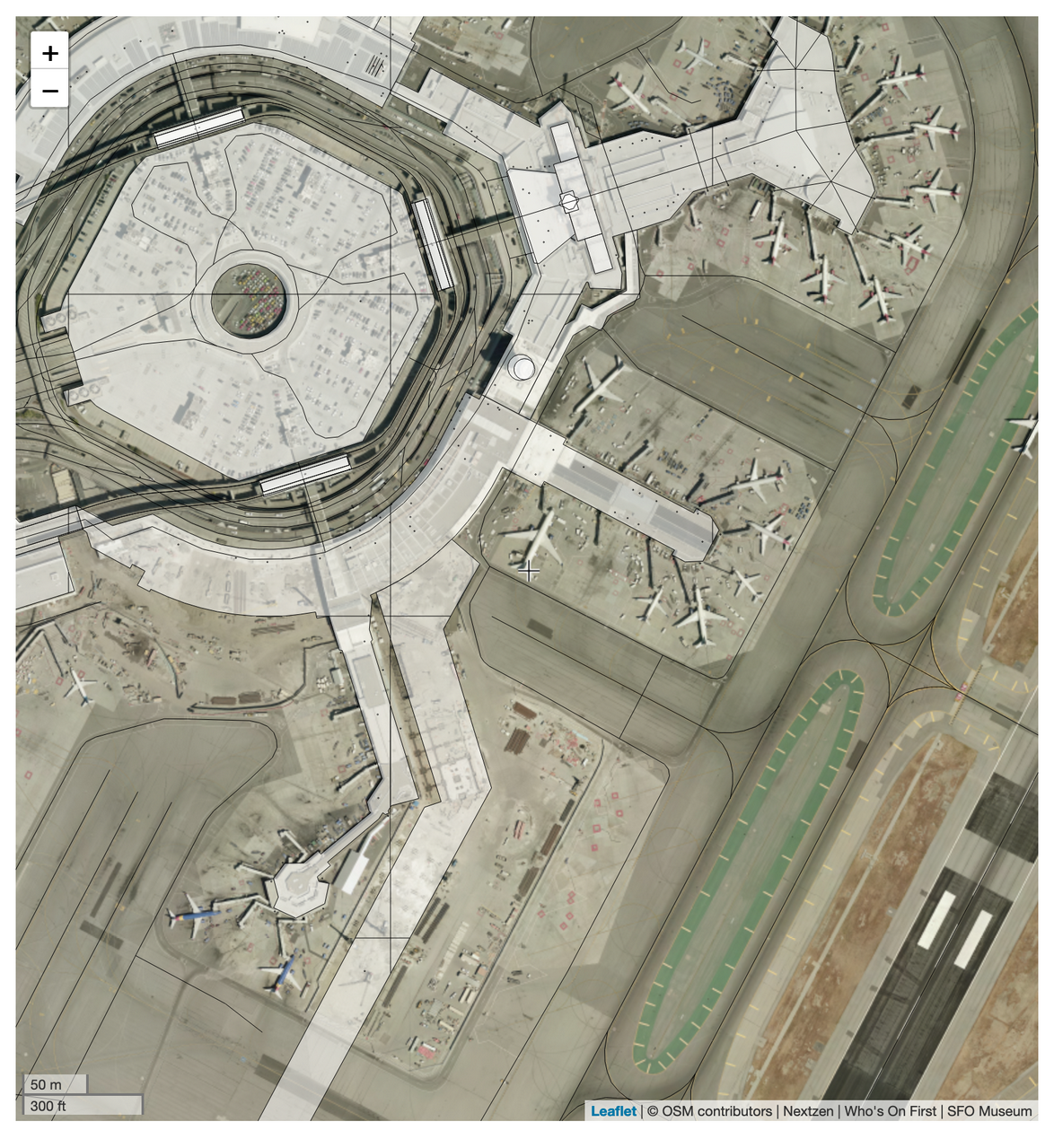
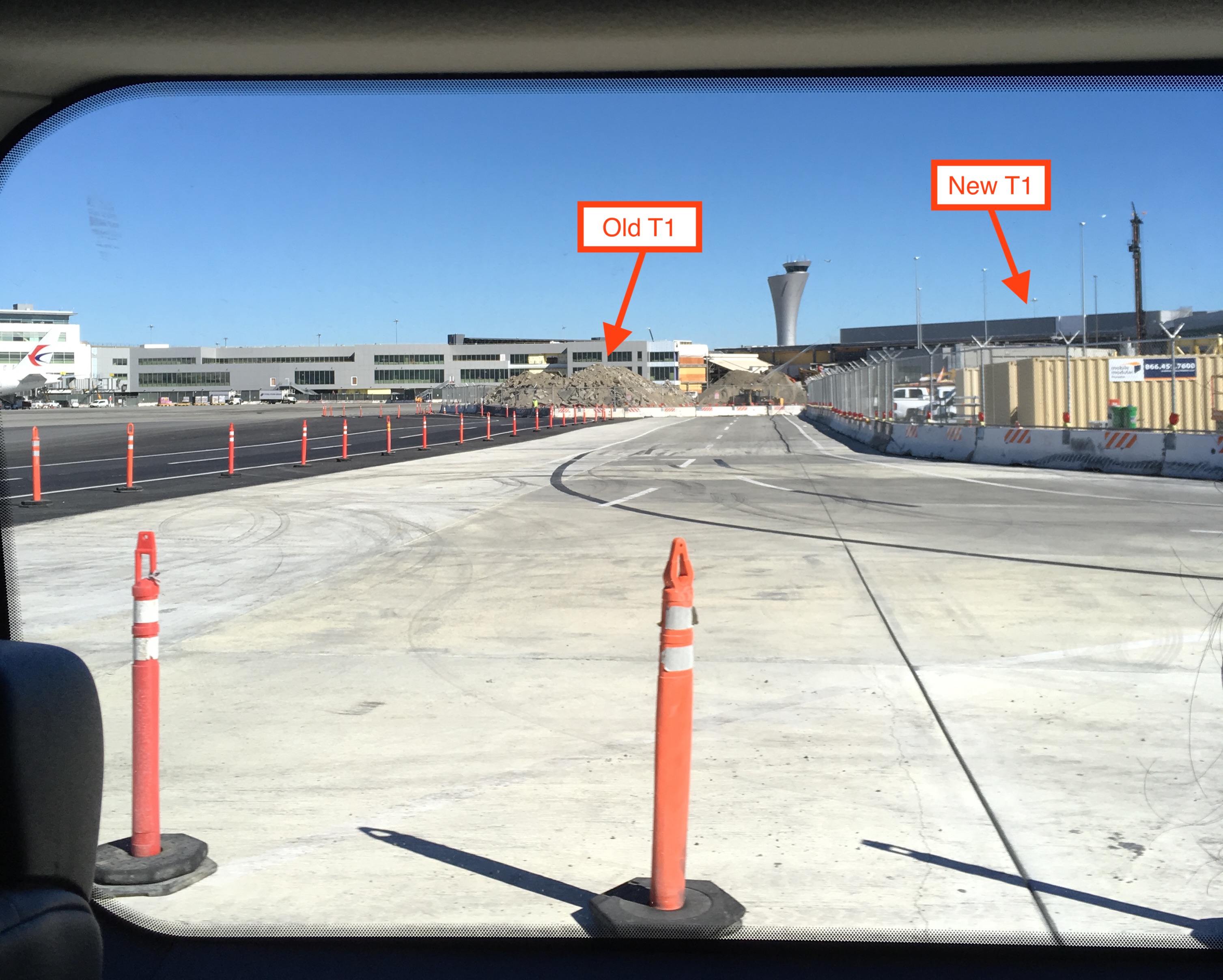
T2 re-opened the following year, in 2011. Two years ago, in 2017, you can see the outline of the new Terminal 1 (T1) taking shape. The new T1 re-opened last summer. A few months later T1 looks like this:
From 2017 onwards, the new aerial maps are incredibly detailed.
The scale of most web-based mapping projects is measured using “zoom” levels. The documentation for leaflet.js, a popular framework for web-based mapping applications, describes zoom levels this way:
Let’s just assume that the world is a square. When we represent the world at zoom level zero, it’s 256 pixels wide and high. When we go into zoom level one, it doubles its width and height, and can be represented by four 256-pixel-by-256-pixel images. At each zoom level, each tile is divided in four, and its size (length of the edge, given by the tileSize option) doubles, quadrupling the area. This goes on and on. Most tile services offer tiles up to zoom level 18, depending on their coverage. This is enough to see a few city blocks per tile.
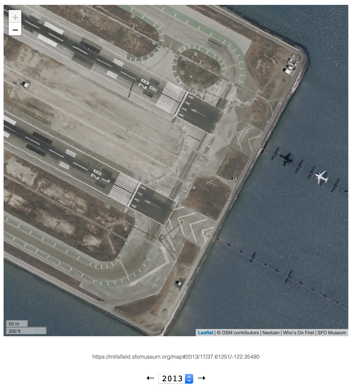
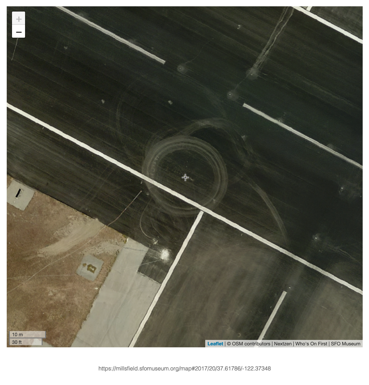
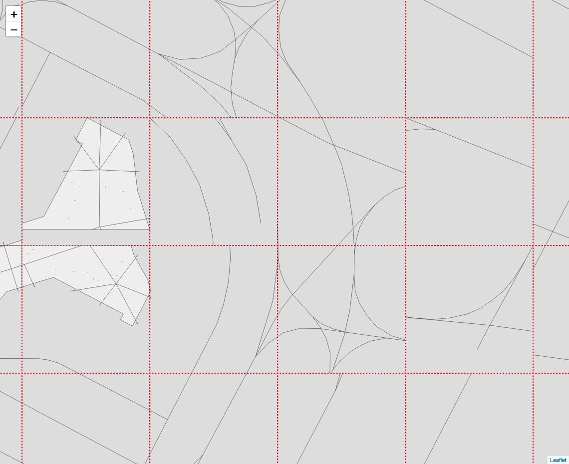
Our most recent maps go all way down to zoom level 20. The detail is pretty amazing:
Mysterious, even:
Wandering around the airport at high zoom levels, seeing the “shape” of airport in its details, is so much fun we’ve added a handy 📷 button to the map that will allow you to create an image of whatever you happen to be looking at:
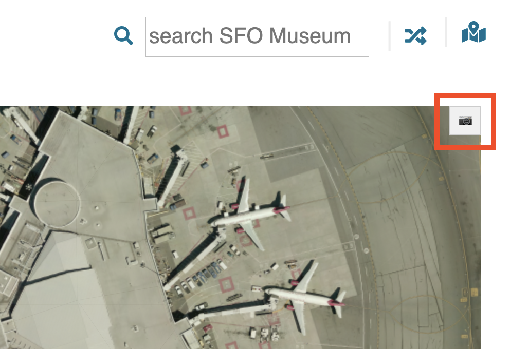
Clicking the button will start an in-browser process to copy all the visible pixels in the map view in to a new image. This process takes about 5-10 seconds and once it’s complete triggers an operating system dialog to save the file to your computer (or open it for viewing in another application).
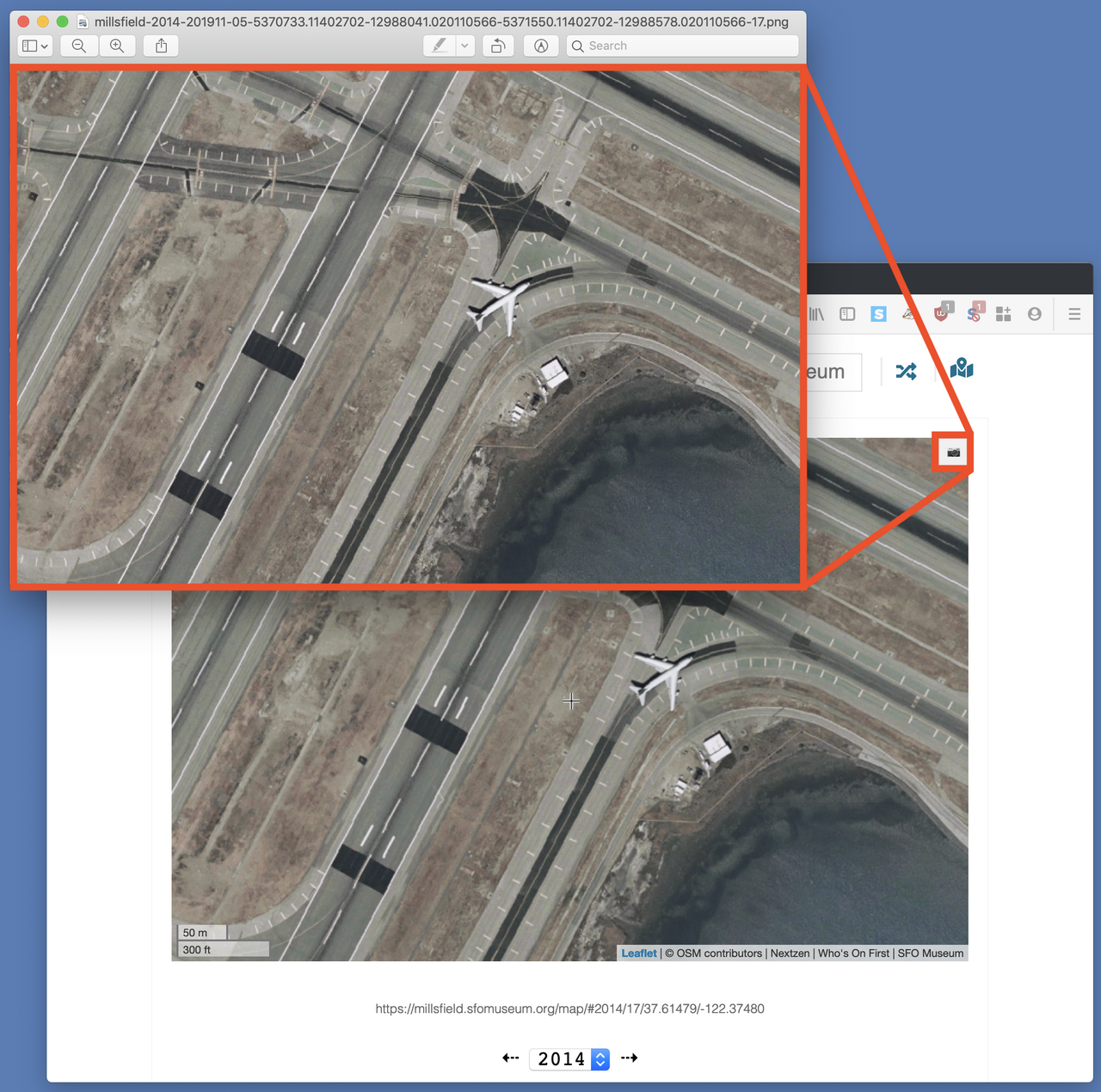
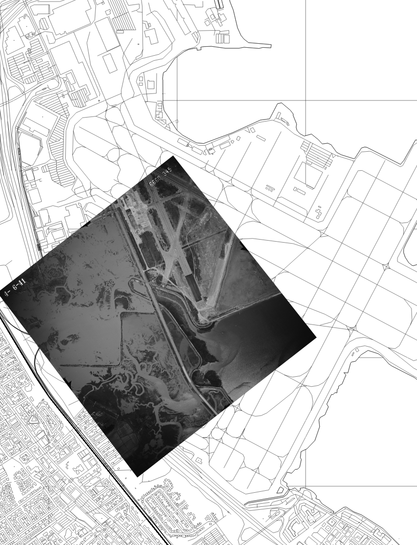
This works for both the aerial imagery and the base tiles. Here’s an example screengrab from 1941:
As of this writing, the base tiles are always rendered underneath the aerial tiles (but we’ll fix that soon).
All of this work has meant updating the base tiles, the simplified black and white cartography that we use for maps of contemporary SFO and the rest of the world.
It was time to update the tiles anyway, to reflect the literal changes “on the ground” to T1, and it was also an opportunity to make some much-needed updates to go-rasterzen the software we use to produce the base tiles. Those changes include:
Support for “over-zooming”
go-rasterzen renders “data” or “vector” tiles produced by Nextzen which stop at zoom level 16. All of the data for zoom levels 17 and higher is contained in the zoom 16 tiles so it is left up to applications consuming the Nextzen tiles to crop those tiles as necessary. This is sometimes referred to as “over-zooming” and now it’s something that go-rasterzen supports.
Better tile seeding
The entire world rendered at zoom level 20 produces 1,099,511,627,776 tiles. We don’t render the whole world at zoom level 20 (or even 17) but the number of tiles covering even just for the area around SFO it starts to add up quickly. We used to keep the list of tiles to pre-seed in memory but that’s been replaced by a generic catalog interface with support for a local SQLite database in addition an in-memory structure.
Admittedly, this is a necessary but not very exciting change.
Bug fixes
Most importantly we fixed a bug where we were incorrectly calculating dimensions when drawing geographies, converting them from a geographic coordinate space to a pixels in a viewport (or tile). This would happen infrequently enough before we had to render tiles at high zoom levels that figuring out what was going on never managed to become the priority. Adding support for over-zooming quickly forced the issue:
The problem was simply that we were doing the math wrong. We assumed, incorrectly, that the extent of the geographies contained in a tile would always equal or exceed the edges of the tile. That is not the case.
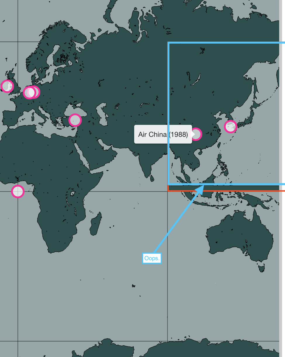
It’s a little hard to see in this screenshot because it doesn’t show the whole tile that was rendered incorrectly, specifically the part that triggered the problem. It’s pretty clear that the countries depicted span the boundaries of the y axis. What you can’t see is that they don’t do the same on the x axis. We were calculating the geographic boundaries of the tile based the edges of countries and continents rather than the tile itself so, unsurprisingly, everything was drawn askew.
Oops.
Support for query-based styles
Styling go-rasterzen tiles has always been limited to stroke and fill colours, widths and opacities. That hasn’t changed but it’s now possible to override default styles using an equally-limited query-based syntax. For example the follow styles definition:
{
    "tile_size": 512.0,
    "stroke": "#515151",
    "stroke_width": 1.0,
    "stroke_opacity": 1.0,
    "fill": "#000000",
    "fill_opacity": 0.0,
    "styles": {
	"geometry.type=[Polygon,MultiPolygon] properties.kind=[ocean,water,lake]":{
	    "stroke": "#515151",
	    "stroke_width": 1.0,
	    "stroke_opacity": 1.0,
	    "fill": "#000000",
	    "fill_opacity": 0.2
	},
	"properties.landuse_kind=[apron,aerodrome]": {
	    "stroke":"#ffffff",
	    "stroke_width": 1.0,
	    "stroke_opacity": 1.0,
	    "fill": "#f11499"
	    "fill_opacity": 0.0
	},
	"geometry.type=[Polygon,MultiPolygon] properties.landuse_kind=[apron,aerodrome]": {
	    "stroke":"#ffffff",
	    "stroke_width": 1.0,
	    "stroke_opacity": 1.0,
	    "fill": "#f11499",
	    "fill_opacity": 0.2
	}
    }
}
Produces tiles that look like this:
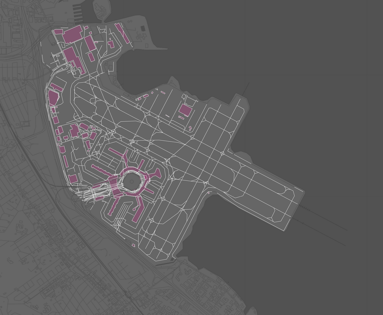
By default everything is rendered grey-on-grey but the SFO campus – things whose landuse_kind property is either apron or aerodrome – is rendered as white with semi-transparent pink fill.
We’ve also made sure that all the map tiles have been clipped to the aerial imagery itself rather than the extent of the area depicted, which would result in ugly opaque borders. We continue to treat aerial maps themselves as Who’s On First (GeoJSON) records:
By using GeoJSON we are able to define a mask for clipping imagery and derive its extent in one handy file, that is compatible with all the geo-processing tools. Other map-related properties include (EDTF) dates:
   "edtf:cessation":"1956-09-08",
   "edtf:inception":"1956-09-08”,
Zoom levels:
   "mz:max_zoom":16,
   "mz:min_zoom":11,
Attributions:
   "src:geom":"ucsblib",
   "ucsblib:id":"gs-vlx_1-61”,
What the map depicts, for example SFO the airport and SFO the terminal complex in 1956:
   "wof:depicts":[
       102527513,
       1159396329
   ],
All of which has the side-effect of these records serving as a de facto map catalog. That’s not the end goal here (there are lots very good pre-existing projects like the StaioTemporal Asset Catalog but it’s always fun to see where these things overlap.
In the meantime, all the new maps are available for browsing here:
Enjoy!