Old maps (and old map tiles) at SFO Museum
Did you notice the aerial overlay of the airport in final image in our last blog post about maps? That’s what this blog post is about.
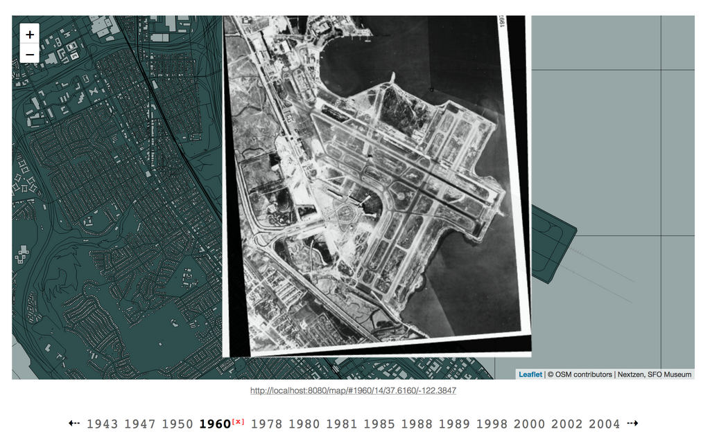
We’ve updated the map to allow you to overlay historic aerial imagery of the airport for over a dozen years between 1943 and 2004. We also have a stack of aerial maps of the airport for every year since 2011 that we’re aiming to get online shortly.
Many of these images are accessioned photographs in the museum’s collection. They are also part of the catalog of data collected by the airport’s GIS department and they’ve done the work to “geo-rectify” these images.
That’s the technical term for mapping all the x,y pixels in an images to their corresponding longitude and latitude coordinates in physical space. And that means that we can put these maps… on the map, now!
Historic maps can be displayed on top of the global map or beneath it to help you understand the “shape” of the airport, both literally and figuratively, at a point in time relative to the airport today.
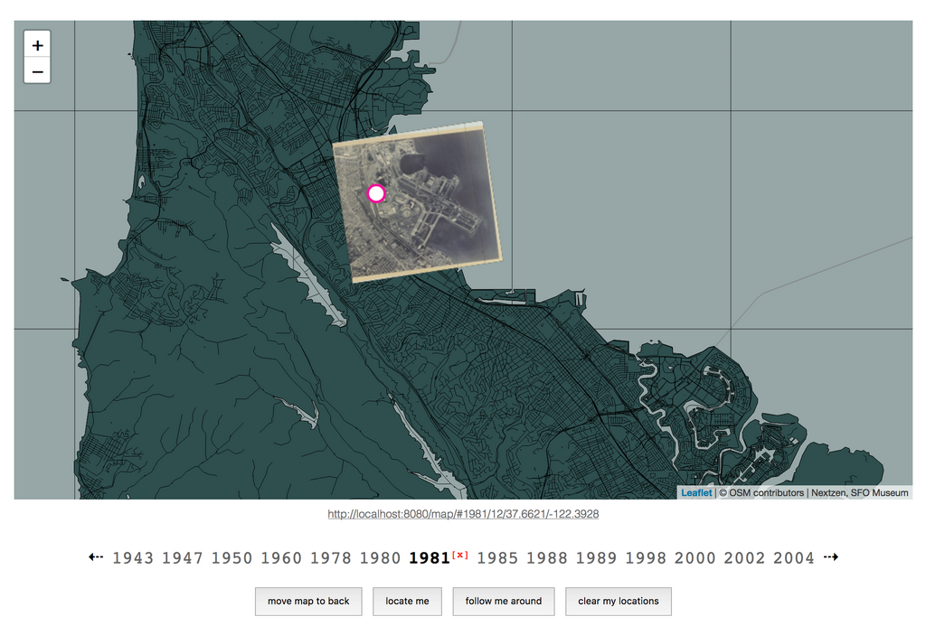
We’ve made sure that the year an aerial image was taken is included in the map’s “permalink” so that it’s easy to link to and share the map at a specific point in time and space. For example:
Or:
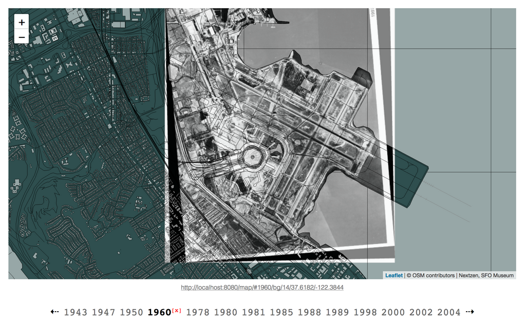
To indicate whether an historic map should be placed in the foreground or the background.
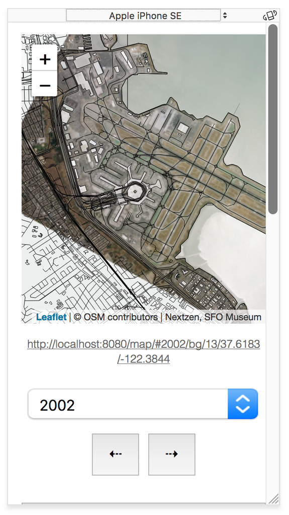
We’ve tried to make sure that everything renders correctly and works smoothly on mobile devices, with their tiny screens.
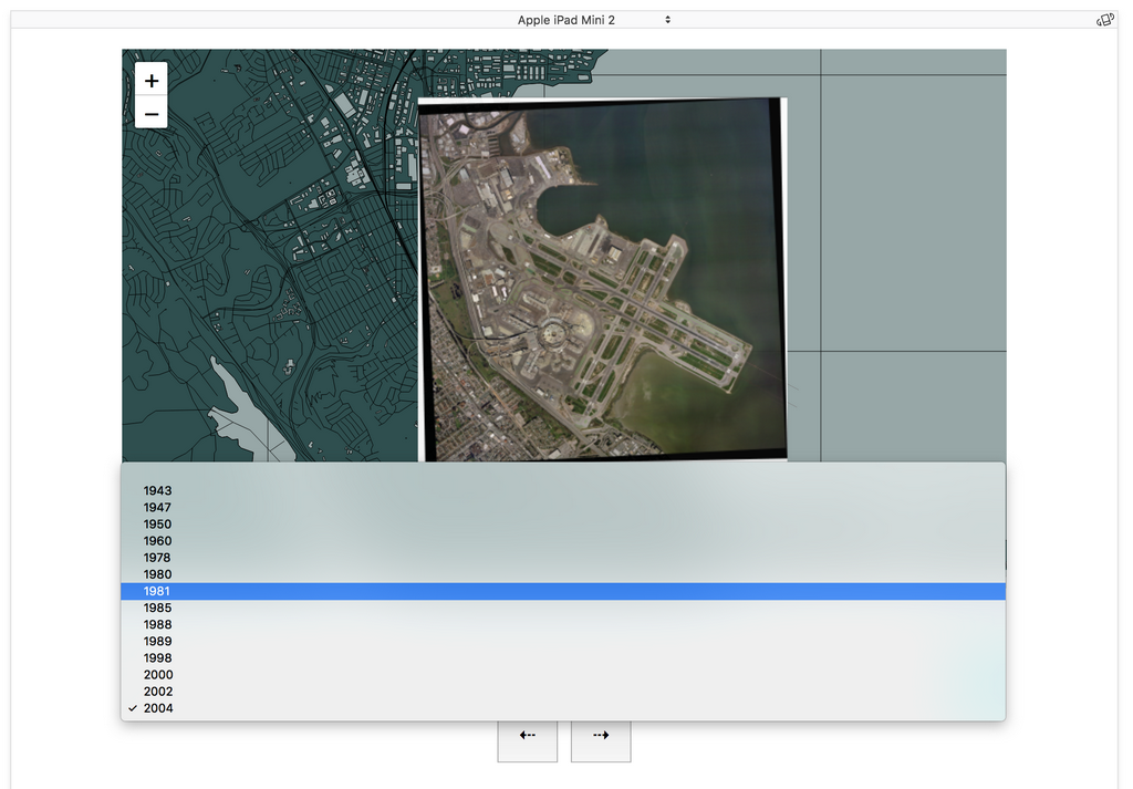
Going forward it’s likely that we’ll replace the desktop list view for years with aerial imagery using a select menu. Our goal is to have more maps to choose from than we can reasonably expect to fit in a standard text-based list.
Not shown in any of the screenshots so far are the locate me and a follow me around buttons beneath the list of available maps. These use the geolocation functionality built in to most modern web browsers and operating systems to locate your device out there in the real world.
For example, the image above shows where I’ve been writing this blog post. In 1981 it was a parking lot.
If you are thinking about clicking the locate me or follow me around buttons and wondering Will the museum (or the airport) record my location when I do? the answer is: No. The location data collected by your browser is only held by your browser for as long as you keep the /map webpage open or until you click the clear my locations button.
If you’re a person who likes to look under the hood and see exactly what’s going on you can review the source code in question.
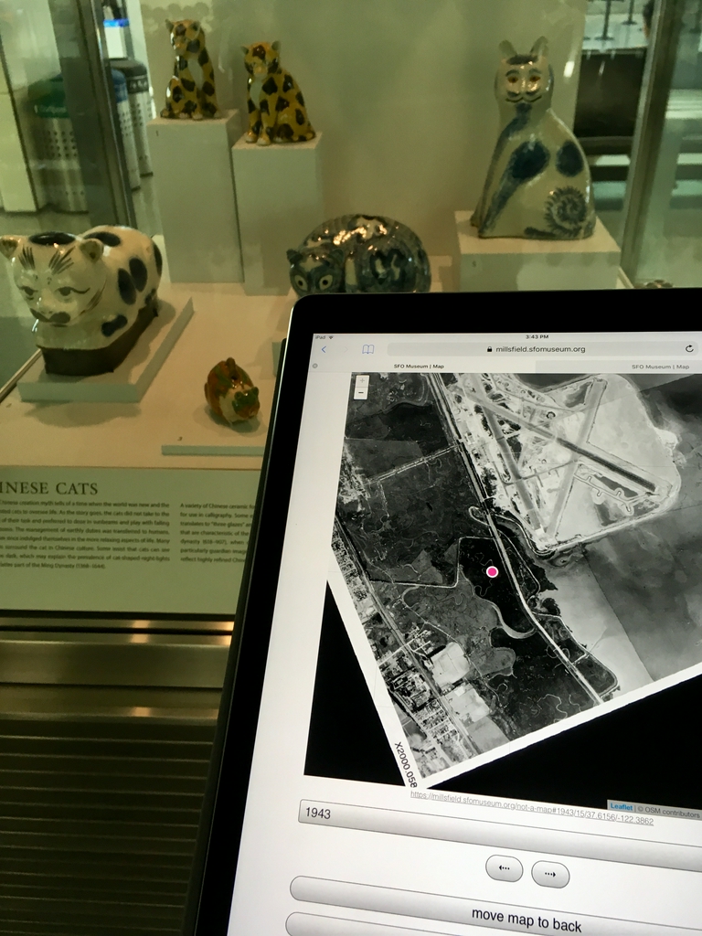
Here is where the recently opened Caticons: The Cat in Art exhibition is located on the A side of the International Terminal, relative to the airport in 1943.
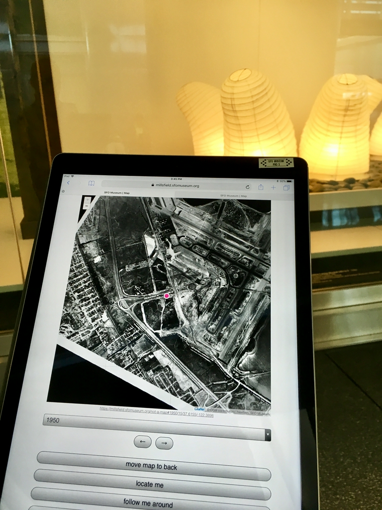
Here is the Isamu Noguchi: Inside and Out exhibition, also in the International Terminal, relative to the airport in 1950.
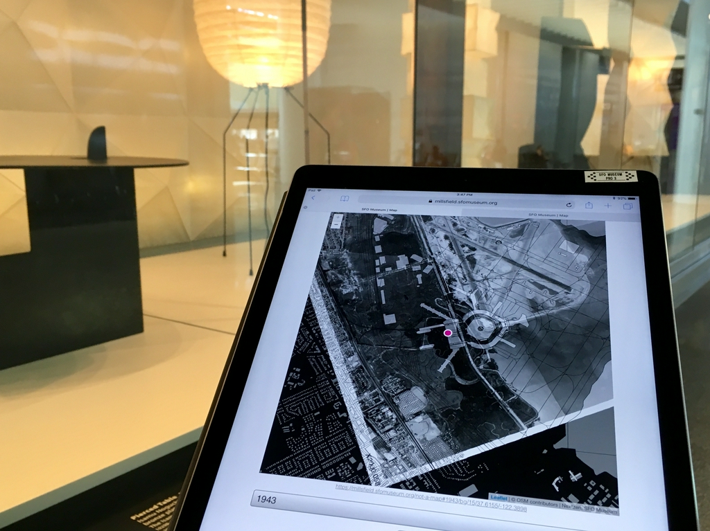
And again in 1943, with today’s airport overlayed.
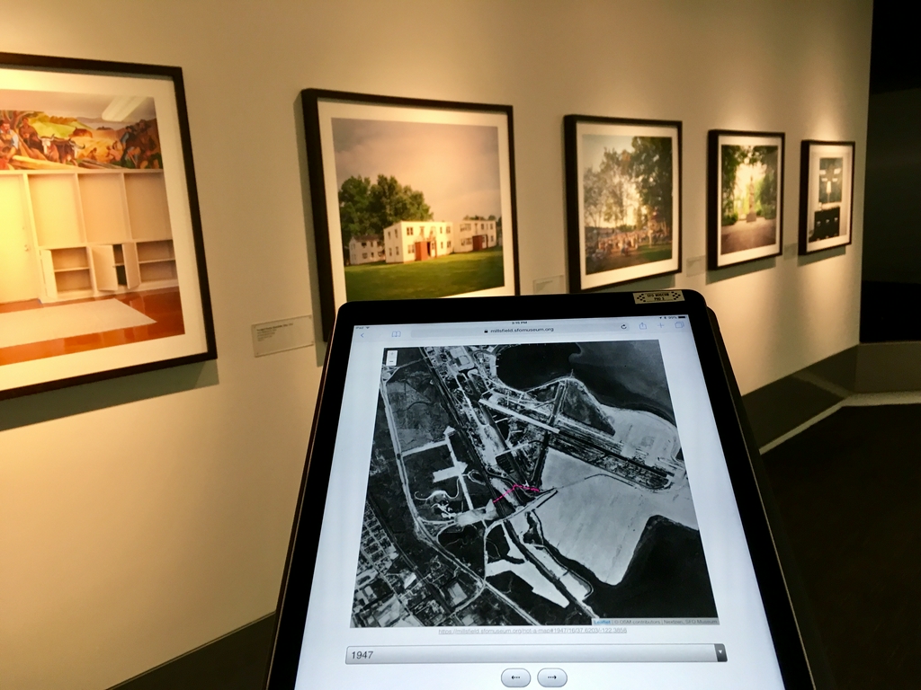
Do you see the pink line overlayed on the map in this photo?
That’s a visualization of the web browser’s geolocation engine tracking me as I walk from the International Terminal to the connector between Terminals 2 and 3, stopping at the Jason Reblando: New Deal Utopias photography exhibition.
In 1947 neither of these things were possible.
It is important, though, to remember that geolocation in a web browser and especially indoor geolocation is still in its infancy so the results can range from good to weird to crazy-town.
Here’s an example:
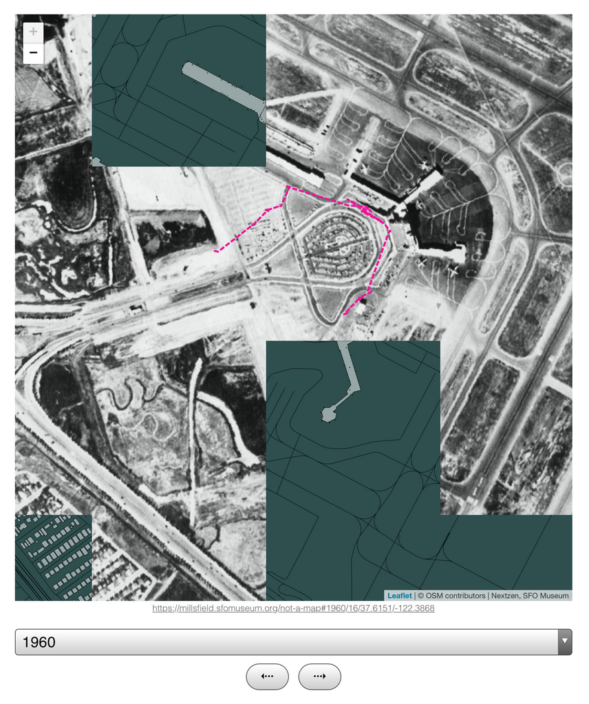
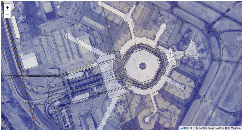
This screenshot was taken midway through the historic map tiles loading. You can see the early planning phases for what is now boarding area F, already underway in 1960, and today’s boarding area B which wasn’t even a twinkle in anyone’s eye back then. It also shows me walking from the International Terminal to Terminal 1 and things more or less make sense.
The path itself is a bit wonky, a reflection of the fact that moving around too much or too quickly seems make the geolocation APIs lack confidence in deciding where you are. Conversely the squiggly lines between Terminals 2 and 3 (or piers B and C, in 1960) is where I stopped to take the photo above and exchanged some text messages with a colleague.
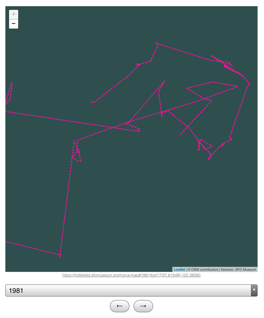
From Terminal 1 I walked up to the AirTrain and hopped on the red line which does a loop around the terminals. At this point I was out of range, more often than not, of the airport wireless network and things started to get a bit strange.
As the AirTrain reaches the stop for Garage A there are fewer and fewer receievers (wireless or cellular) and as it leaves the station I am suddenly transported out on the airfield, at least in the eyes of the web browser because that’s the location of the closest receiver.
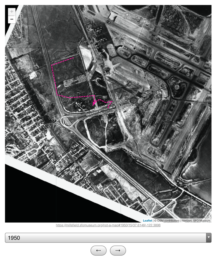
Here’s another example traveling back to West Field Road from the G side of the International Terminal. As you can see Westfield Road, or something like it, was already there in 1950 (and as even early as 1943).
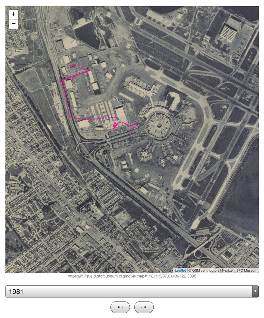
And again thirty years later in, in 1981, before Central Terminal was demolished and replaced by Terminal 2.
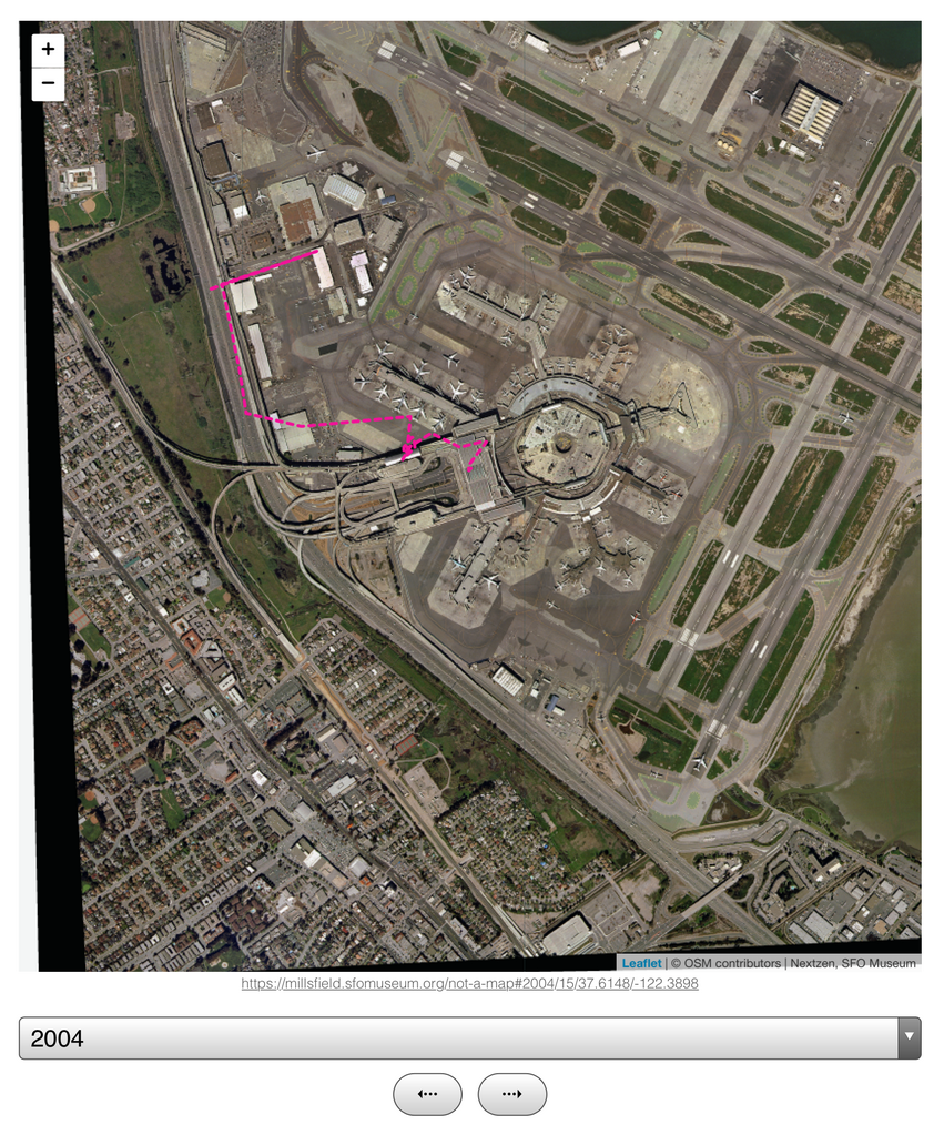
And finally in 2004, after the AirTrain was built and the new Internation Terminal was opened when there were two “boarding area A”s, one in the Internation Terminal and the other in Terminal 1.
The next steps for this project are, roughly in this order:
Adjust and clean up some of the older maps.
Aerial map imagery is a useful lens on to the history of satellite imagery, remote sensing and scanning technologies over the years. In 2018, we are used to crisp perfect imagery but that wasn’t always possible and you can see the results in some of our older maps. There are tools and techniques for producing if not sharper images then at least images with a higer contrast so we’ll start to investigate that soon.
Add support for offline-viewing.
These maps need to connect to the internet at least once to fetch data but after that they should “just work” whether or not you are still online. The same is true about anything the museum does online, really, so we’re going to use the map as a way to work out the details going forward.
Fill in the gaps
Ideally we would like historic aerial imagery for every year since 1927 when the city first leased the land the airport now occupies. We’d also like aerial imagery for the surrounding Bay Area since SFO exists as a part of a larger community and those stories have a relationship with our story.
Rinse and repeat
Finally, once we have worked out all the kinks and understand how things work, we’d like to do the same for all the other airports that SFO holds hands with. Everybody who passes through SFO is either going to or coming from another airport and so by definition their histories are entwined with ours.
Until then we invite you to enjoy the old and new maps that we’ve put online so far at: