More old maps and more-better architectures
Maps
In an earlier blog post introducing aerial maps on the Mills Field website we said that our goal was …to have more maps to choose from than we can reasonably expect to fit in a standard text-based list.
That day is today.
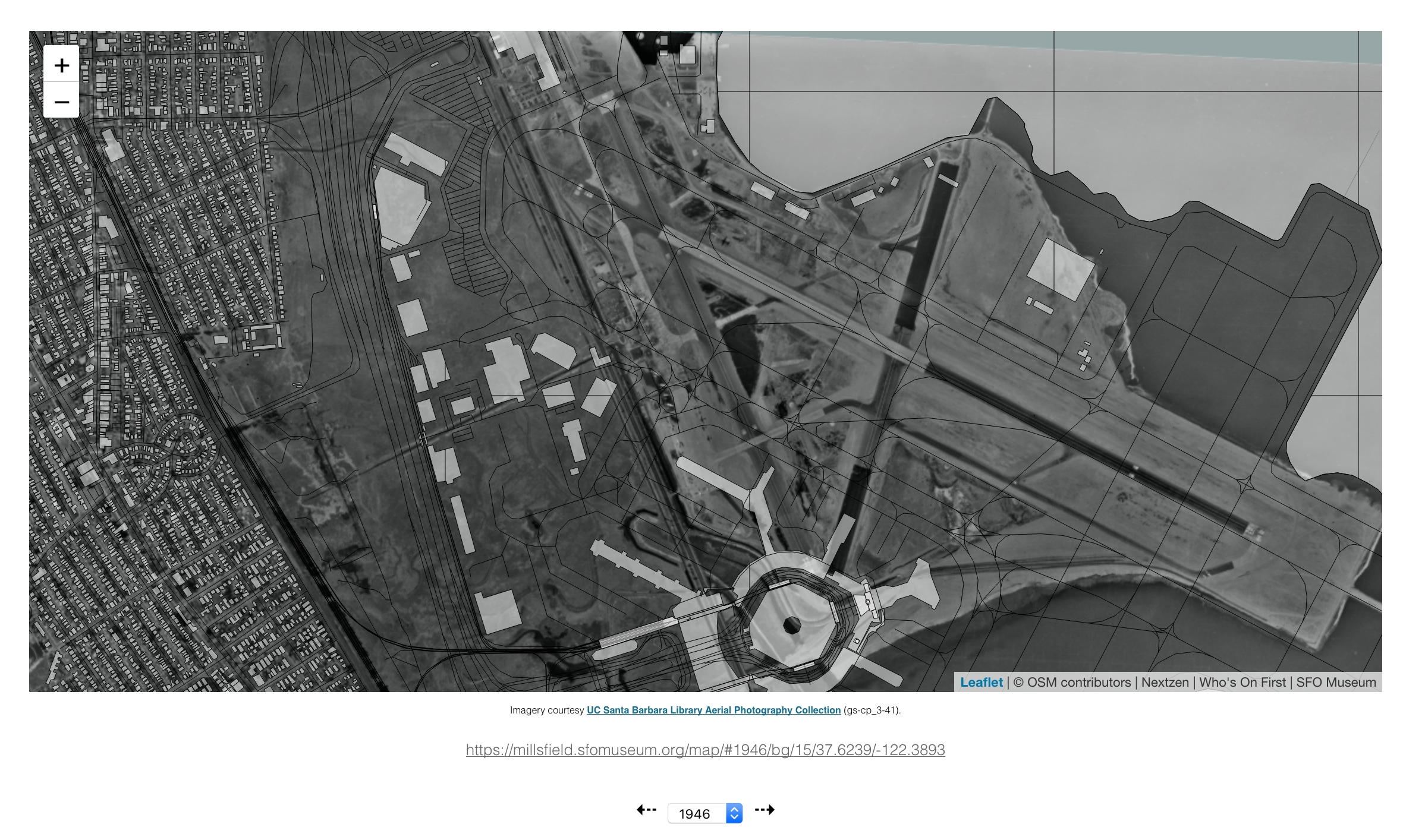
Thanks to the hard work of the nice people in the SFO GIS Department to georectify new-found imagery we’ve added aerial maps for the airport and surrounding area for the years 1946, 1956, 1965, 1970, 1972, 1997, 1999 and 2006.
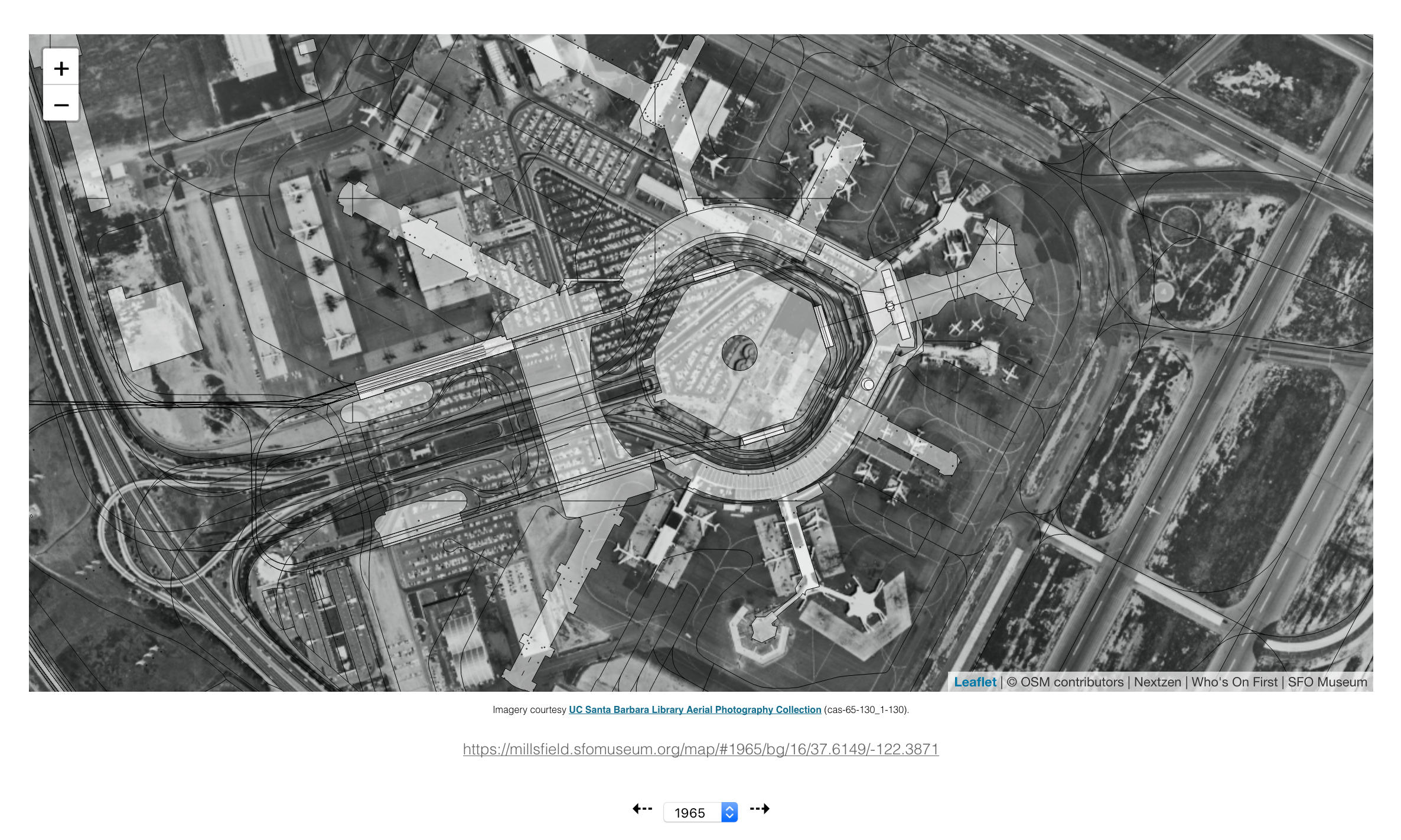
We’ve also started importing maps and filling in the years from other sources, notably the Aerial Photography Collection at the UC Santa Barbara Library, like this map from 1965.

As well as maps from SFO Museum’s own collection like this image from 1972. Do you notice Rotunda A just to the right of the present-day International Terminal A? We’ll come back to that shortly.
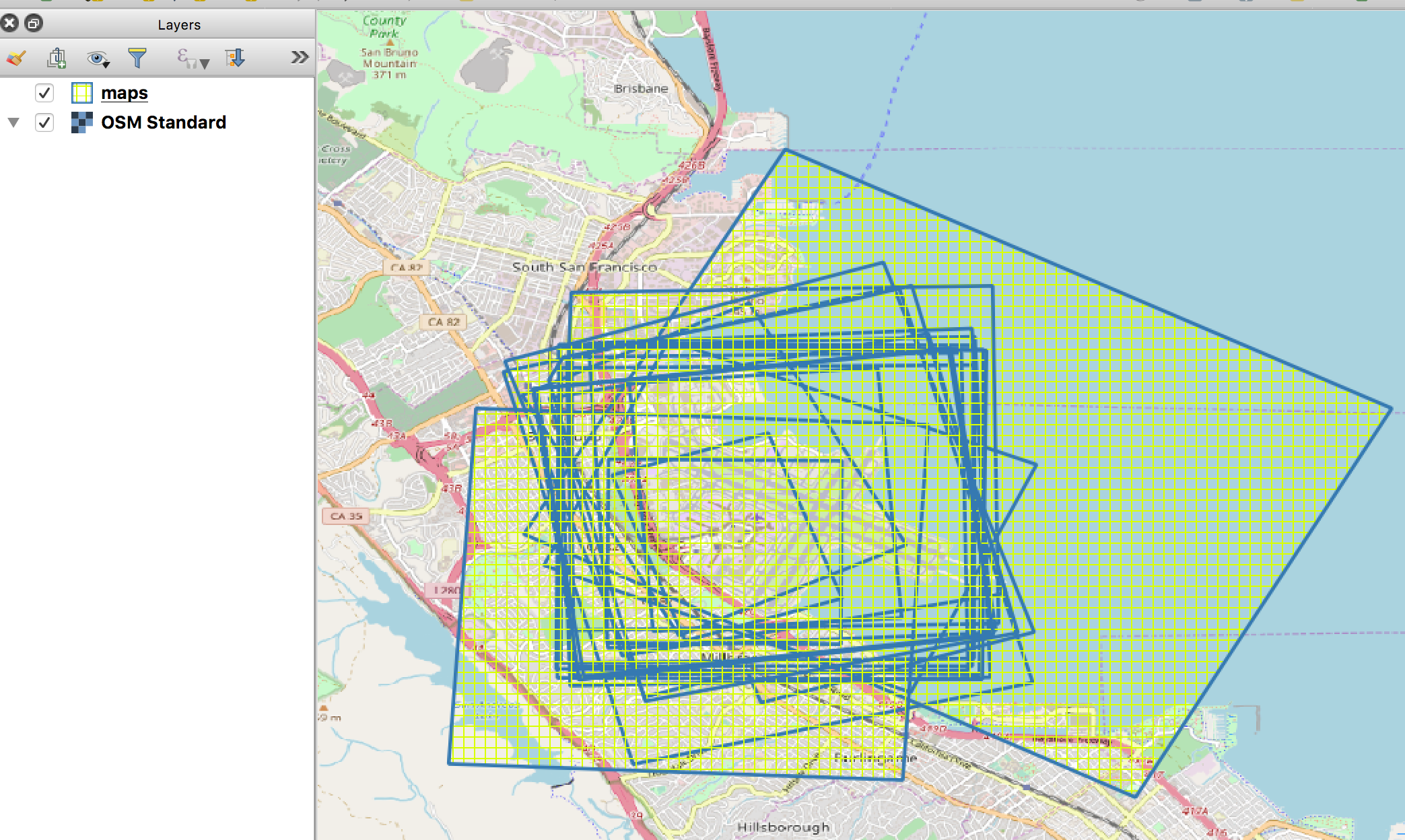
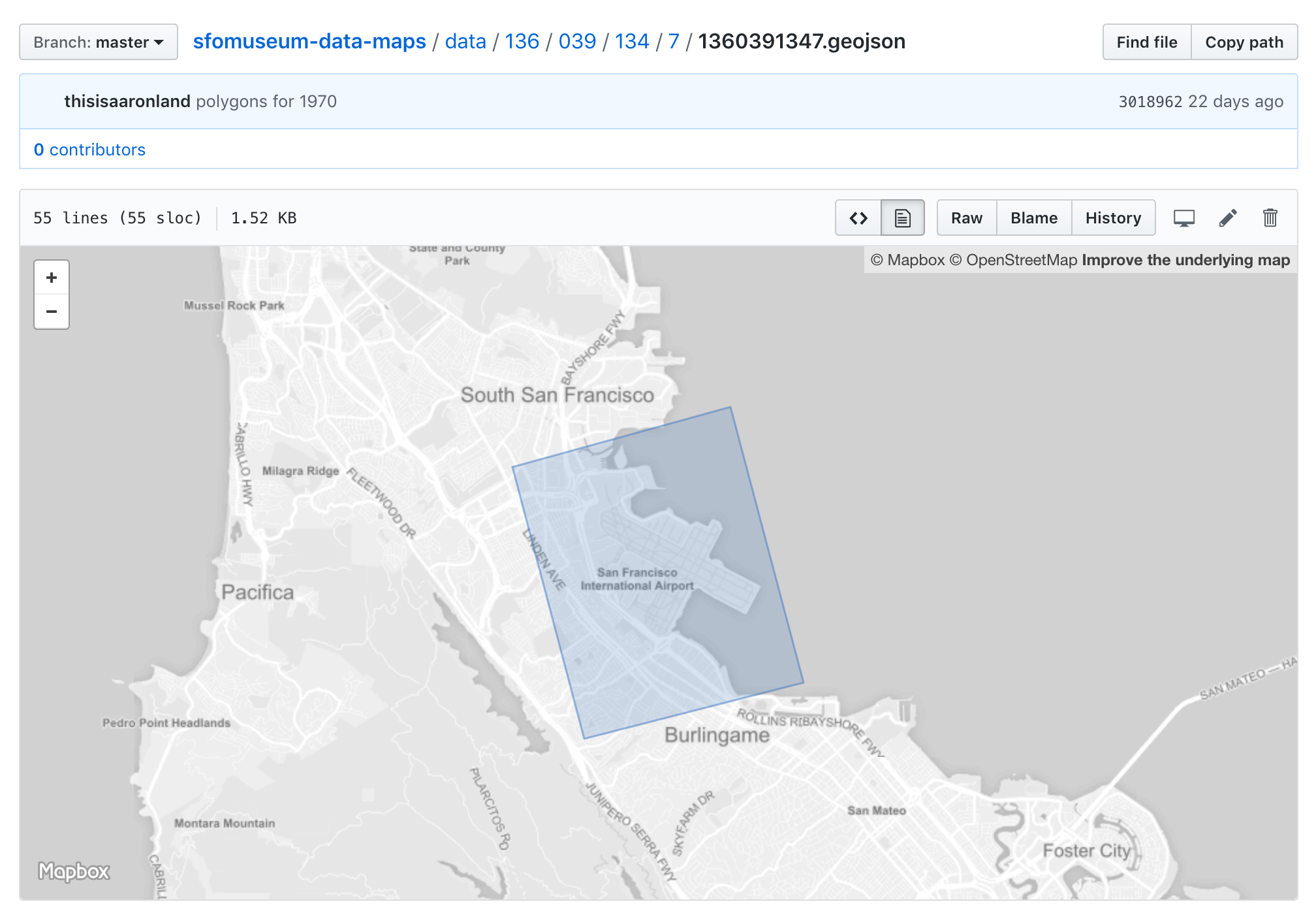
We’ve also started cataloging all of these maps the same way we do architecture and other features that are relevant to the airport and the museum’s collection. This is early work and subject to change but every map we display is included as a GeoJSON file complete with a stable identifier, geographic and temporal extents and source information.
The catalog does not contain individual map tiles or aerial imagery and is available from the sfomuseum-data GitHub account.
Architectures
We have also, again with the help of the ever-fantastic SFO GIS Department, updated the so-called cardboard cutout
geometries for buildings and terminals that we released last summer. Those early shapes have been updated by tracing from the aerial imagery described above and, in certain cases like Terminal 3, merging contemporary spatial data.
These were the building geometries first published in late-August of 2018:

These are the building geometries as of October 2018:

We still need to update the geometries for boarding areas as well as finesse some of the terminals but that will happen shortly.
Why are all these different versions
of SFO important? Let’s consider this photo of the Rotunda A extension to South Terminal, taken while it was under construction.

Associating the photo with this SFO (from 1963-74) might make sense since it was taken in 1971.

The rule of thumb though for a “phase shift” (when one SFO is superseded by another) is the requirement that a change be visible and tangible to passengers. Rotunda A wasn’t opened until 1974 so arguably this SFO (from 1974-79) is more correct.
This SFO (before 1963) definitely doesn’t make any sense since no part of South Terminal (now Terminal 1) had been built yet.

Nor does this SFO (from 1979-81) make any sense since North Terminal (now Terminal 3) wasn’t built until 1979 eight years after the photo was taken.

All of these many SFOs are important because they help to contextualize things (like the photo of Rotunda A) in the moment but also to demonstrate how that context has changed over the years.
We’ve also begun to add other buildings on the SFO campus, notably the original San Francisco Airport Administration Building.
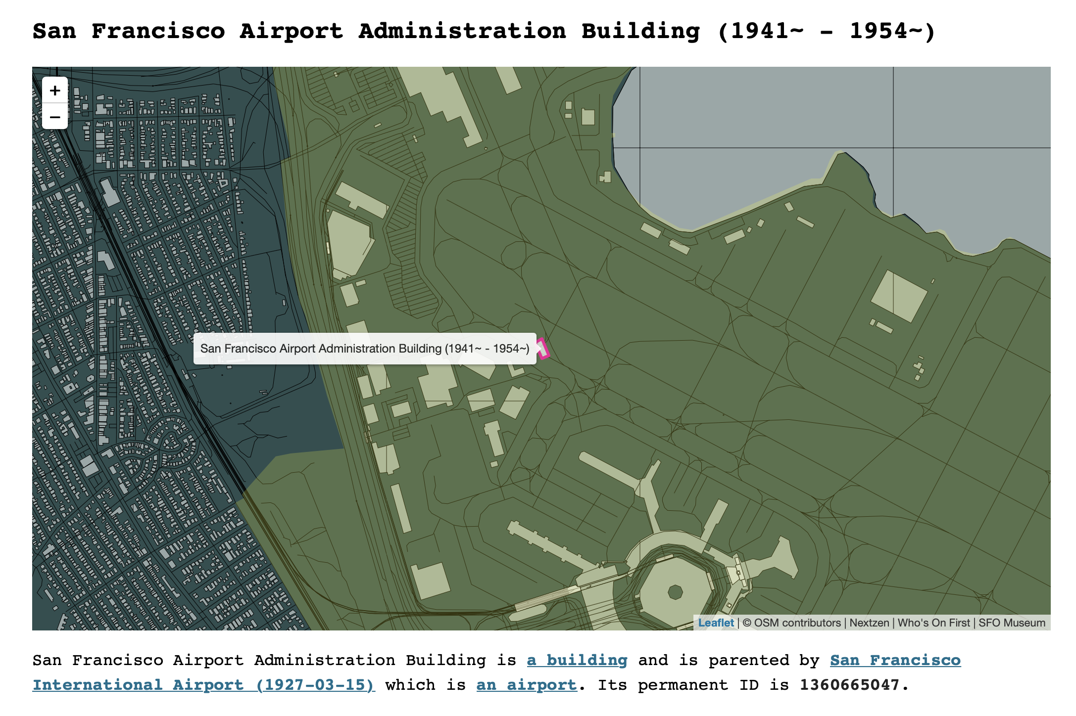
The Administration Building, long since gone, sat on what is now the Zebra taxiway which runs alongside the 10R/28L runway frequented by many of the large wide-body planes flying across the Atlantic or the Pacific. These include the Lufthansa A380 that flies from San Francisco to Frankfurt.
This plane often takes off from the Eastern edge of the airport (runway 28R) but takes the long way to get there, looping over the Western end of the two runways (10R/28L and 10L/28R) and traveling the length of the runway again before turning around for departure.

Which means that every day this A380 lumbers through the ghost of the original San Francisco Airport Administration building. The general consensus around the office is that the A380 is probably bigger than the building itself.

In his 2017 review Lufthansa Business Class from San Francisco to Frankfurt Scott Mackenzie mentions the A380’s exterior cameras saying: As we taxied to the runway, I started checking out the different views, including one feature that shows the airplane overlaid on a very detailed satellite map.
It is fun to dream up all the things we might build going forward, whether it’s for a seat-back screen or a personal device, as SFO Museum releases more and more geospatially (and temporally) enabled data about the airport!
Distributions
Finally, for developers:
A reminder that in addition to publishing data on the sfomuseum-data GitHub account we are also publishing SQLite distributions of all our data (architecture, public art, places and more soon!) on the Mills Field website.
For an introduction to why SQLite databases are interesting I’d recommend reading Simon Willison’s The interesting ideas in Datasette. Datasette is Simon’s tools for “open source tool for exploring and publishing structured data” in SQLite databases and generally full-of-good.
There are also handy RSS (and Atom) feeds that are updated every time a new (SQLite) distribution is published so you can be informed of changes to our data as they happen.